


Most of us are aware that cross-origin use of windows.prompt(), windows.alert() and windows.confirm() from windows API are going to be deprecated. Browsers like safari and chrome are going to end support for these methods.

Salesforce has therefore developed its own modules to deal with the alert, prompt, and confirm.
It introduced the below modules.
- LightningAlert
- LightningPrompt
- LightningConfirm
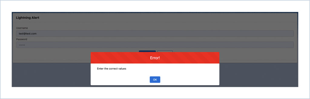
LightningAlert – Use this to display a message to the user that requires his/her attention.
Properties of LightningAlert
There are three variants of the lightning alert,
- success – shows a green-themed alert.
- error – shows a red-themed alert.
- warning – shows an orange-themed alert.
The variant can be changed by setting the theme attribute as mentioned below. The alert component can be set in three different properties.
- message – the message that wants to be displayed on dialog.
- theme – this is used to change the variant of the component.
- label – this is the header label for the dialog.
Steps :
1, The LightningAlert can be imported from the lightning/alert module which will launch the alert modal, and call LightningAlert.open() with the desired attributes.
2, Use LightningAlert on the components to communicate a state that affects the entire system, not just a feature or page. LightningAlert.open() doesn’t halt execution on the page, it returns a Promise. Use async/await or .then() for any code that want to execute after the alert has closed.
LWC :
LightningAlertDemo.html
<template>
    <lightning-card title="Lightning Alert">
        <div class="slds-box slds-theme_default">
            <lightning-input
                    type="email"
                    label="Username"
                    value={username}
                    onchange={handleUsernameChange}>
            </lightning-input>
            <lightning-input
                    type="password"
                    label="Password"
                    value={password}
                    onchange={handlePasswordChange}>
            </lightning-input>
            <div class="slds-m-top_small slds-align_absolute-center">
                <lightning-button
                    variant="brand"
                    label="Proceed"
                    class="slds-m-left_x-small"
                    onclick={handleProceed}>
                </lightning-button>
                <lightning-button
                    variant="brand-outline"
                    class="slds-m-left_x-small"
                    label="Cancel"
                    onclick={handleCancel}>
                </lightning-button>
            </div>
        </div>
    </lightning-card>
</template>
LightningAlertDemo.js
import { LightningElement } from 'lwc';
import LightningAlert from 'lightning/alert';

export default class LightningAlertDemo extends LightningElement {
    username = "";
    password = "";

    handleUsernameChange(event){
        this.username = event.target.value;
    }

    handlePasswordChange(event){
        this.password = event.target.value;
    }

    handleCancel() {

    }

    async handleProceed(){
            await LightningAlert.open({
                message: 'Enter the correct values',
                theme: 'error',
                label: 'Error!',
                variant: 'header',
        });
    }
}
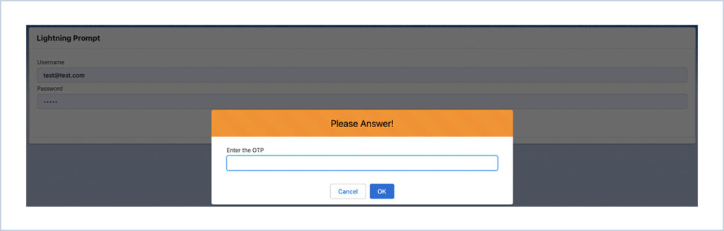
LightningPrompt – Use this when you have to take the user’s input to do further action.
There are three parameter of the lightning prompt,
- message – the message that wants to be displayed on dialog.
- theme – this is used to change the variant of the component.
- label – this is the header label for the dialog.
Steps
- The LightningPrompt can be imported from the lightning/prompt module which will launch the alert modal, and call LightningPrompt.open() with the desired attributes.
- The lightning/prompt module allows to create a prompt modal within the component. The LightningPrompt can be used on the components to ask the user to provide information before continuing.
LWC :
LightningPromptDemo.html
<template>
    <lightning-card title="Lightning Prompt">
        <div class="slds-box slds-theme_default">
            <lightning-input
                    type="email"
                    label="Username"
                    value={username}
                    onchange={handleUsernameChange}>
            </lightning-input>
            <lightning-input
                    type="password"
                    label="Password"
                    value={password}
                    onchange={handlePasswordChange}>
            </lightning-input>
            <div class="slds-m-top_small slds-align_absolute-center">
                <lightning-button
                    variant="brand"
                    label="Proceed"
                    class="slds-m-left_x-small"
                    onclick={handleProceed}>
                </lightning-button>
                <lightning-button
                    variant="brand-outline"
                    class="slds-m-left_x-small"
                    label="Cancel"
                    onclick={handleCancel}>
                </lightning-button>
            </div>
        </div>
    </lightning-card>
</template>
LightningPromptDemo.js
import { LightningElement } from 'lwc';
import LightningPrompt from 'lightning/prompt';

export default class LightningPromptDemo extends LightningElement {
    username = "";
    password = "";

    handleUsernameChange(event){
        this.username = event.target.value;
    }

    handlePasswordChange(event){
        this.password = event.target.value;
    }

    handleCancel() {

    }

    async handleProceed(){
        const result = await LightningPrompt.open({
                message: 'Enter the OTP',
                theme: 'warning',
                label: 'Please Answer!',
                variant: 'header',
                defaultValue: '',
        });
        if(result == 123456){
            //add logic to proceed
        }
        else{
            //logic for error
        }
    }
}
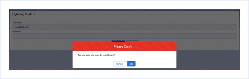
LightningConfirm – Use this when you need to take the user’s confirmation to proceed.
There are three parameter of the lightning confirm,
- message – the message that wants to be displayed on dialog.
- theme – this is used to change the variant of the component.
- label – this is the header label for the dialog.
Steps
- The LightningConfirm can be imported from the lightning/confirm module which will launch the alert modal, and call LightningConfirm.open() with the desired attributes.
- The lightning/confirm module allows to create a confirm modal within the component. The LightningConfirm can be used on the components to ask the user to provide confirmation before continuing.
LWC :
LightningConfirmDemo.html
<template>
    <lightning-card title="Lightning Confirm">
        <div class="slds-box slds-theme_default">
            <lightning-input
                    type="email"
                    label="Username"
                    value={username}
                    onchange={handleUsernameChange}>
            </lightning-input>
            <lightning-input
                    type="password"
                    label="Password"
                    value={password}
                    onchange={handlePasswordChange}>
            </lightning-input>
            <div class="slds-m-top_small slds-align_absolute-center">
                <lightning-button
                    variant="brand"
                    label="Proceed"
                    class="slds-m-left_x-small"
                    onclick={handleProceed}>
                </lightning-button>
                <lightning-button
                    variant="brand-outline"
                    class="slds-m-left_x-small"
                    label="Cancel"
                    onclick={handleCancel}>
                </lightning-button>
            </div>
        </div>
    </lightning-card>
</template>
LightningConfirmDemo.js
import { LightningElement } from 'lwc';
import LightningConfirm from 'lightning/confirm';

export default class LightningConfirmDemo extends LightningElement {
    username = "";
    password = "";

    handleUsernameChange(event){
        this.username = event.target.value;
    }

    handlePasswordChange(event){
        this.password = event.target.value;
    }

    handleCancel() {
    }

    async handleProceed(){
        const result = await LightningConfirm.open({
            message: 'Are you sure you want to reset fields?',
            variant: 'header',
            label: 'Please Confirm',
            theme: 'error',
        });

        if(result==true){
            this.username = "test@test.com";
            this.password = "***********";

        }
    }
}


 .
.