Objective :
In this blog, we are about to see and understand the concept of the viewport and how it plays a part in the designing layout for the mobile responsive website in LWC sites.
Steps :
- Create a Lightning Web Component of any name let us keep the layout name as a “webLayout”.
- Create an Aura Component of the name “WebLayoutApp”.
- Create a Visual Force page with the name “Weblayout”.
- Go to your developer or any sandbox account and then create a site and integrate the above visual page in a subdomain.
Creating a web layout using viewport code :
- Write your design layout code which you want to implement for the site with the required HTML, CSS & JavaScript.
- All the code is executed within the rules of the framework SLDS.
- Next, add the viewport code in the aura component for the file “webLayoutAppController.js”.
- Then you see your layout in the mobile view.
Layout design in mobile view :
In this view, we have used a viewport that automatically shrinks to give any device.

Creating a web layout without using viewport code :
- Write your design layout code which you want to implement for the site with the required HTML, CSS & JavaScript.
- All the code is executed within the rules of the framework SLDS.
- Then you see your layout in the mobile view.
Layout design in mobile view without viewport :
In this view, we have not used a viewport that automatically not shrinks from giving any device. It will remain the same as in the desktop view.
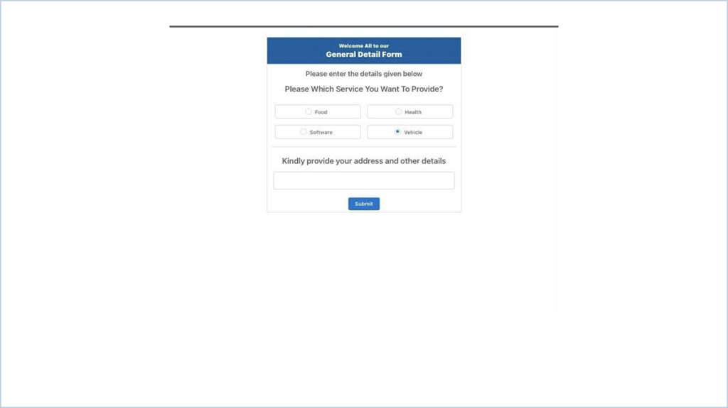
Layout design in mobile view without viewport and added media queries CSS code :
In this view, we have not used a viewport that automatically shrinks to give any device using media queries code used for the font style and text size of the given layout.
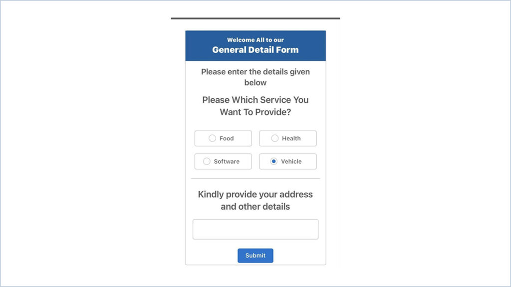
WebLayout.html
<template>
<div class="demo-only demo-only--sizing slds-grid slds-wrap">
<div class="slds-small-size_1-of-12 slds-medium-size_3-of-12 slds-large-size_3-of-12 slds-col slds-size--1-of-12"></div>
<!-- Section Starts-->
<div class="slds-small-size_10-of-12 slds-medium-size_6-of-12 slds-large-size_6-of-12 slds-col slds-size--10-of-12 slds-m-top_large">
<div class="slds-card slds-text-align_center box-content">
<div class="slds-card__body slds-card__body_inner header-bg slds-p-around_small">
<div class="subheader-txt slds-text-title_bold">Welcome All to our</div>
<div class="header-txt slds-text-title_bold">General Detail Form</div>
</div>
<div class="slds-card__body slds-card__body_inner">
<span class="sub-title-txt">Please enter the details given below </span>
</div>
<div> </div>
<div class="slds-card__body slds-card__body_inner slds-m-left_small slds-m-right_small slds-p-around_x-small margin-top">
<span class="qtn-txt">Please Which Service You Want To Provide? </span>
</div>
<div class="slds-border_bottom slds-m-left_small slds-m-right_small slds-m-top_xx-small slds-p-bottom_small">
<div class="demo-only demo-only--sizing slds-grid slds-wrap">
<div class="slds-size_6-of-12">
<div class="slds-box slds-box_x-small slds-text-align_center slds-m-around_x-small">
<span class="slds-radio">
<input type="radio" id="radio-61" value="radio-61" name="default" checked="" />
<label class="slds-radio__label" for="radio-61">
<span class="slds-radio_faux"></span>
<span class="slds-form-element__label">Food</span>
</label>
</span>
</div>
</div>
<div class="slds-size_6-of-12">
<div class="slds-box slds-box_x-small slds-text-align_center slds-m-around_x-small">
<span class="slds-radio">
<input type="radio" id="radio-66" value="radio-61" name="default" checked="" />
<label class="slds-radio__label" for="radio-61">
<span class="slds-radio_faux"></span>
<span class="slds-form-element__label">Health</span>
</label>
</span>
</div>
</div>
<div class="slds-size_6-of-12">
<div class="slds-box slds-box_x-small slds-text-align_center slds-m-around_x-small">
<span class="slds-radio">
<input type="radio" id="radio-67" value="radio-61" name="default" checked="" />
<label class="slds-radio__label" for="radio-61">
<span class="slds-radio_faux"></span>
<span class="slds-form-element__label">Software</span>
</label>
</span>
</div>
</div>
<div class="slds-size_6-of-12">
<div class="slds-box slds-box_x-small slds-text-align_center slds-m-around_x-small">
<span class="slds-radio">
<input type="radio" id="radio-68" value="radio-61" name="default" checked="" />
<label class="slds-radio__label" for="radio-61">
<span class="slds-radio_faux"></span>
<span class="slds-form-element__label">Vehicle</span>
</label>
</span>
</div>
</div>
</div>
</div>
<div class="slds-card__body slds-card__body_inner slds-m-left_small slds-m-right_small slds-p-around_x-small">
<span class="qtn-txt">Kindly provide your address and other details </span>
</div>
<div class="slds-p-around_medium slds-m-top_xx-small margin-top"><lightning-textarea name="input4"></lightning-textarea></div>
<div class="slds-m-top_xx-small slds-m-bottom_xx-small">
<button class="slds-button slds-button_brand">Submit</button>
</div>
</div>
</div>
<!-- next button section starts-->
<!-- Section Ends-->
<div class="slds-small-size_1-of-12 slds-medium-size_3-of-12 slds-large-size_3-of-12 slds-col slds-size--1-of-12"></div>
</div>
</template>
WebLayout.css
.header-bg
{
   background-color:#0060A2;
   margin:0px;
}

.header-txt
{
   color: #fff;
   font-size: 2.1rem;
}
.subheader-txt
{
   color: #fff;
   font-size:1.5rem;
}

.sub-title-txt
{
   color: #5e5e5e;
   font-size:1.75rem;
   font-weight:400px!important;
}

.qtn-txt
{
   color: #5e5e5e;
   font-size: 1.25rem;
}

.bottom-border-section
{
   border-bottom-color:#ccc!important;
}

.margin-top
{

   margin-top: -25px;
}

@media only screen and (min-device-width: 321px) and (max-device-width: 480px)
and (orientation:portrait)
{
  .header-txt
  {
     color: #fff;
     font-size: 1.2rem;
  }

  .subheader-txt
  {
     color: #fff;
     font-size:0.8rem;
  }

  .sub-title-txt
  {
     color: #5e5e5e;
     font-size:18px;
     font-weight:bold;
  }

  .qtn-txt
  {
     color: #5e5e5e;
     font-size:16px;
  }
}
Viewport Code :
This code to be used in aura component giving the file name webLayoutAppController.js
({
   doInit : function(component, event, helper) {
   let meta = document.createElement("meta");
      meta.setAttribute("name", "viewport");
      meta.setAttribute("content",
   "width=device-width,maximum-scale=1.5, user-scalable=no");
   document.getElementsByTagName('head')[0].appendChild(meta); }
})- The width=device-width part sets the width of the page to follow the screen-width of the device (which will vary depending on the device).
- Maximum-scale defines the maximum zoom & user-scalable=no, which means the website is not allowing the user to zoom in or zoom out.
Difference between the layout using a viewport & without a viewport
As you can see in both layouts with a viewport we can able understand the layout automatically wrap according to device structure, But when we don’t use a viewport the layout remains as per the desktop view for that we can have to separate CSS code in media queries to look perfect in the mobile and tab views
| With View Port | Without View Port | |
| 1) | Automatic wrap of the layout | No automatic wrap of the layout |
| 2) | Fewer media queries CSS code to be written | More media queries CSS code to be written |
| 3) | Mostly used in general register form with many fields | Mostly used in a general questionnaire form with fewer fields fit in one screen |
| 4) | Come with a Side Scroll bar if the content part increase | Come without a Side Scroll bar |
| 5) | Code to be written as per the device rule of the mobile device standards in CSS | Some code to change as per the device rule of the mobile device standards to bring perfect view for the layout |




 .
.